About the Project
The Impact of COVID-19 on the Stock Market and its Sectors
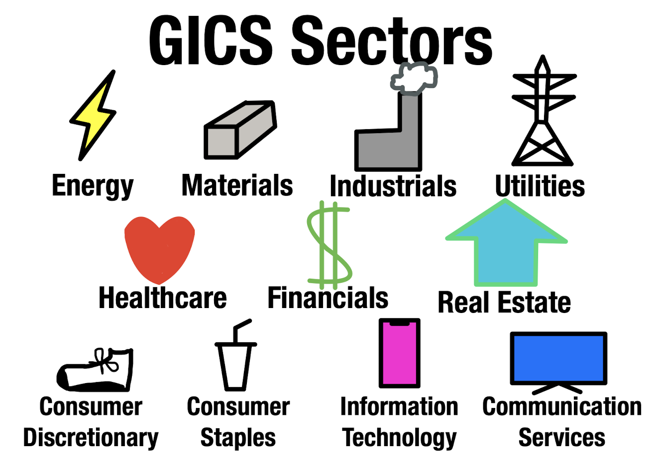
This project visualizes the effects of COVID-19 upon different stock market sectors like healthcare, technology, and energy to give perspective on the impact of a pandemic on different sectors
GitHub Repository of this Project
Goals
Display the immediate and long-term impacts of the pandemic
Visualize the differences in each sector’s performance after the pandemic
Compare the performance in sectors during different stages of the pandemic
Give insight into which sectors perform well/poorly during a pandemic
Understand potential causes for market performance
- Based off of trends and reasoning
Calculations
The data was split into 12 parts: the S&P 500 and the 11 GICS sectors
The 5 highest weighted stocks in the S&P 500 by sector was chosen to represent each sector. Visit the sources page or click here to view which stocks specifically were used and how the list was determined.
The mean of the prices of each set of stocks per sector for each day was calculated, and then the price data following August 1st, 2019 was compared relative to the price data on August 1st, 2019 to identify a percent change from that date. This was doen to demonstrate a shift in price over an extended period of time, relative to prices before the onset of the pandemic.
The dates represented are approximate, but they intend to show a balanced set of data from before and during the pandemic, especially emphasizing the shift in performance from when COVID-19 was officially declared as a pandemic by the World Health Organization to when vaccinations for the virus were initially being distributed.
How this was created
The visualizations and data parsing was done using the R programming language. Libraries like gganimate and plotly were used to make the graphs animated and interactive, respectively.
The code can all be viewed here, the GitHub repository for this project
This website was created using Distill, which is a publication format for scientific and technical writing, native to the web.
Learn more about using Distill for R Markdown at https://rstudio.github.io/distill.
About Me
Greetings! My Name is Ronit Anandani. I am a senior at James B Conant High School and I look towards exploring the world of data science, technology, and finance. I was intrigued on observing and visualizing the performance of specific sectors during the COVID-19 pandemic as the general market was too broad to provide insight into what types of stocks do well in such a scenario, and specific stocks are too specific to understand the general performance of a type of stock during such a scenario.
This project is my final project in Preceptor Kane’s Data Science Bootcamp, which was a summer course that taught elements of the Gov 1005: Data class at Harvard.
- “This is data science”
- Preceptor
Kane’s Free High School Data Science Bootcamp